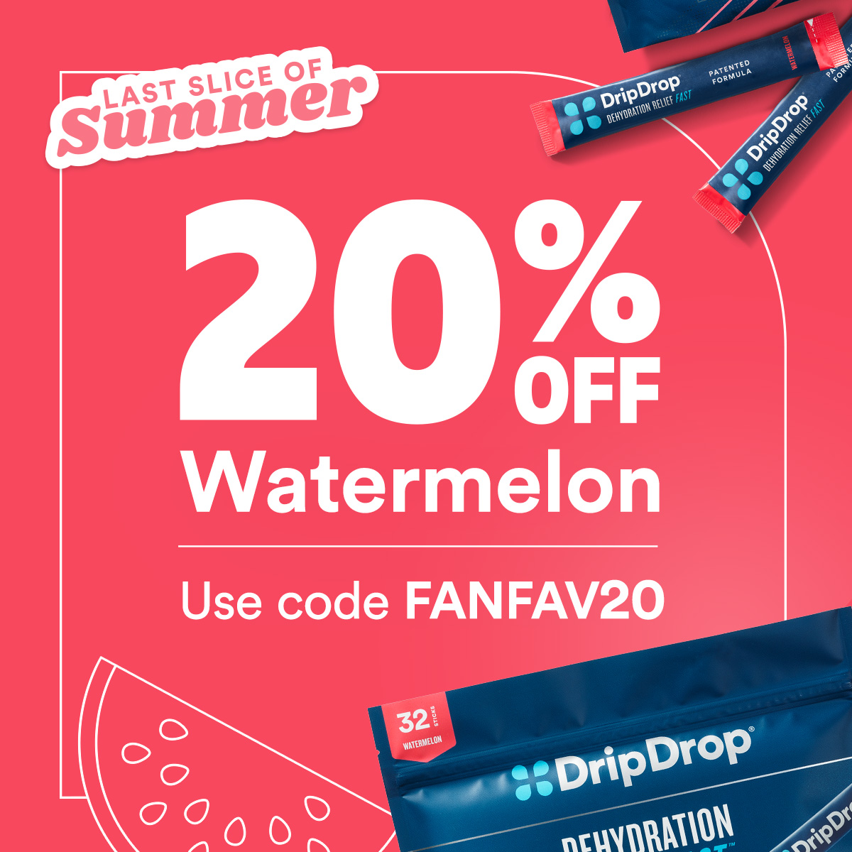
DripDrop Promo Redesign
This redesign was a response to a desire from marketing to visually differentiate regular promotions from paid ads, both of which were relying heavily on lifestyle photography from the same shoots.
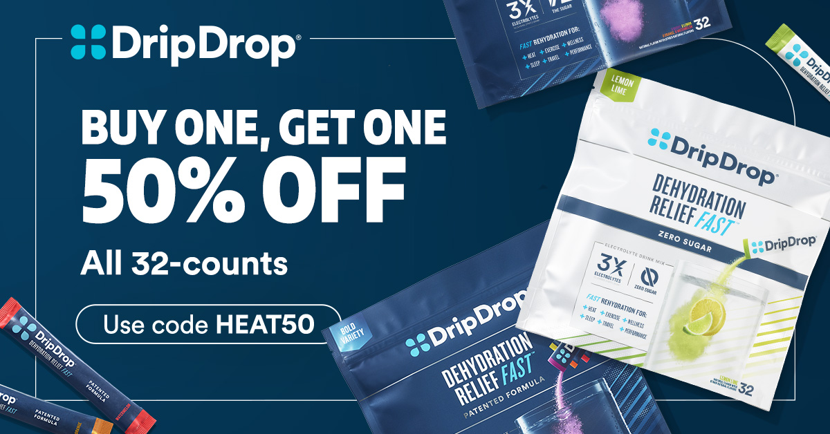
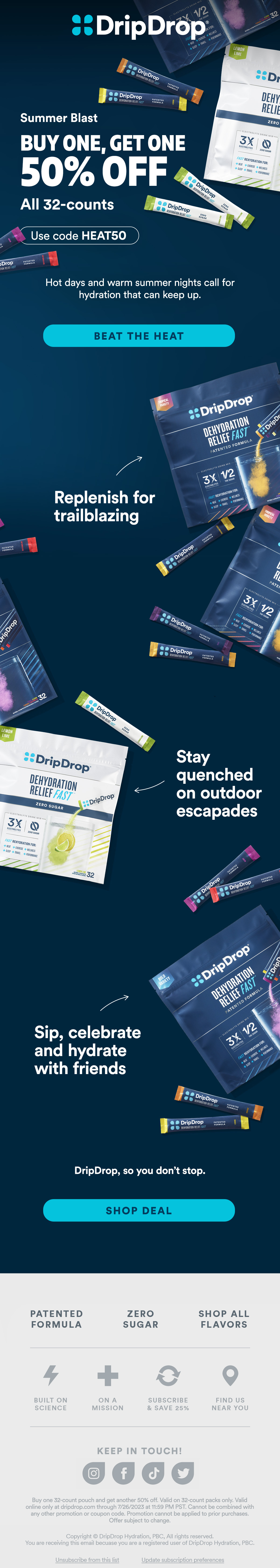
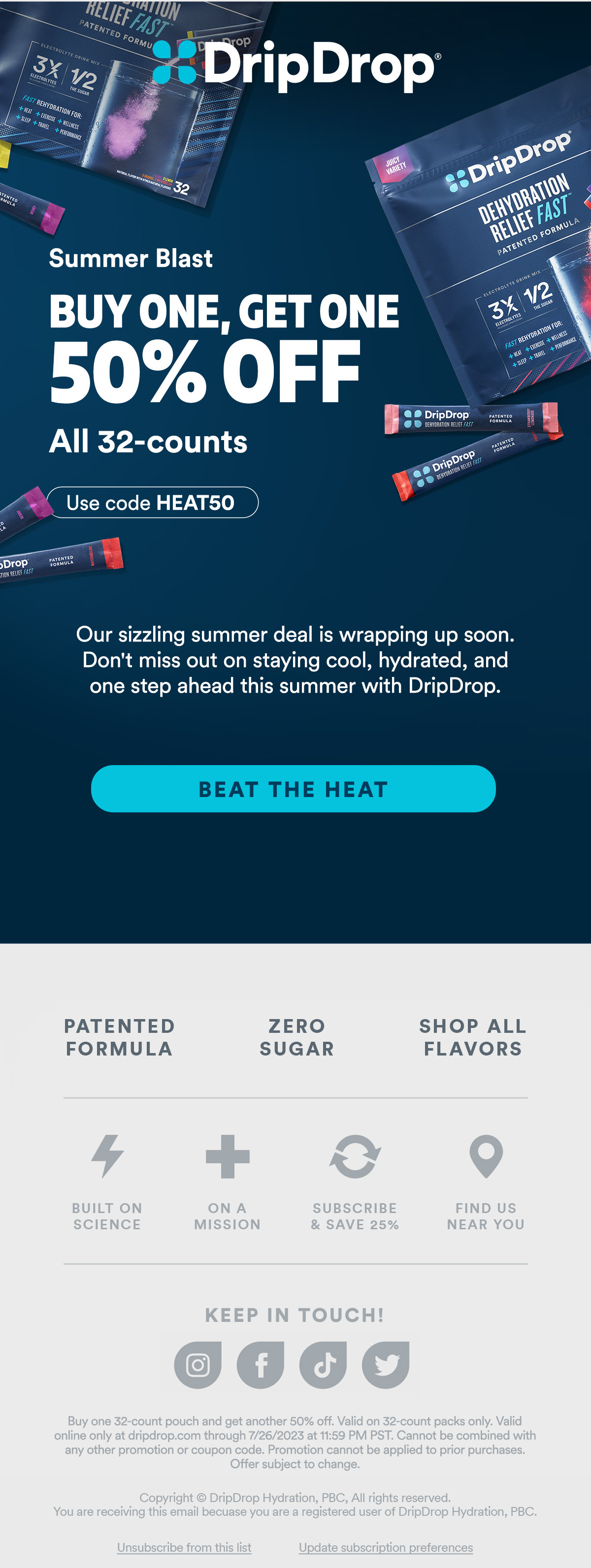
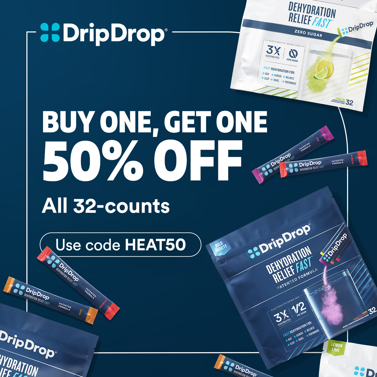
The first iteration used a gradient made of brand blues, product flatlays, and flavor or use-case callouts.
Announcement email
Reminder email
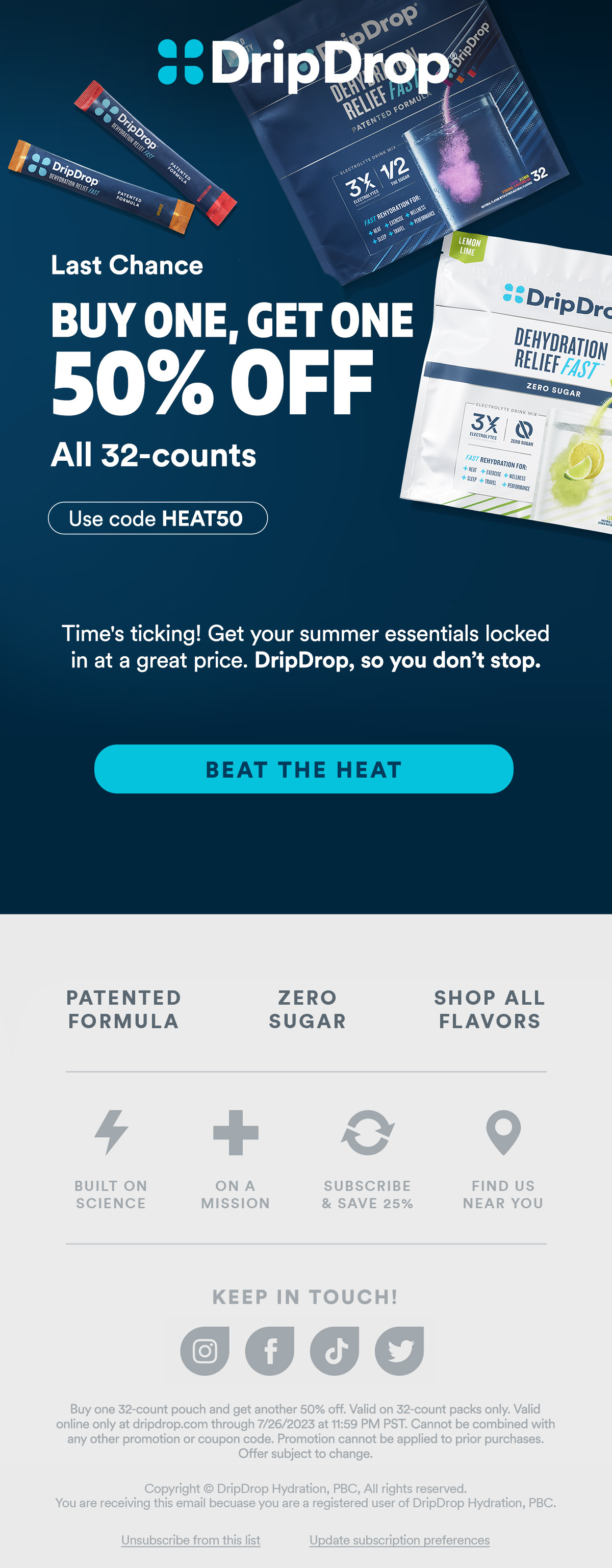
Last chance email
Google ad
Instagram story
SMS
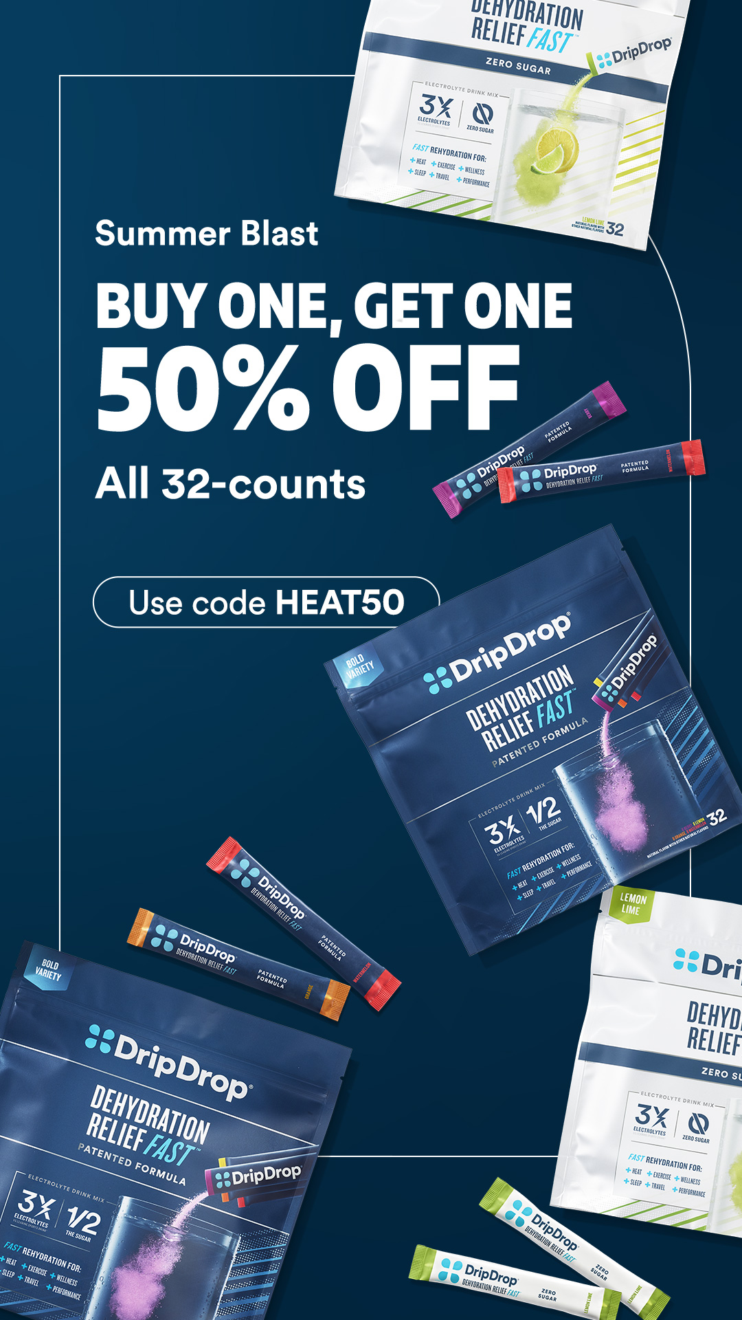
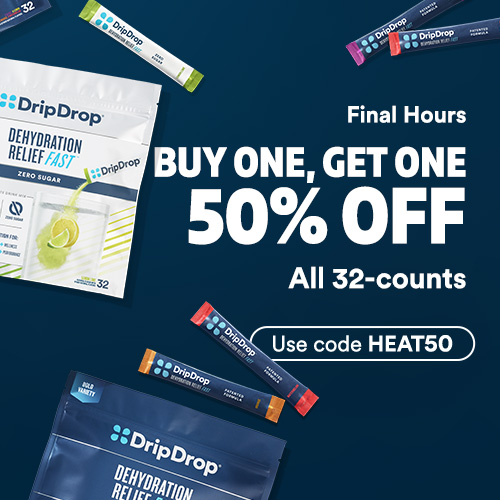
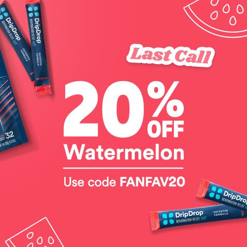
After finding that the brand blues felt too similar when running promos back to back over several months, I worked through a second iteration: something more flavor or seasonal theme focused, intended to differentiate when promos are running more frequently. These featured the same packaging photos from the previous iteration but with brighter colors, bolder promotional type, a logo lockup for the sale name, and illustrations to round out the design.
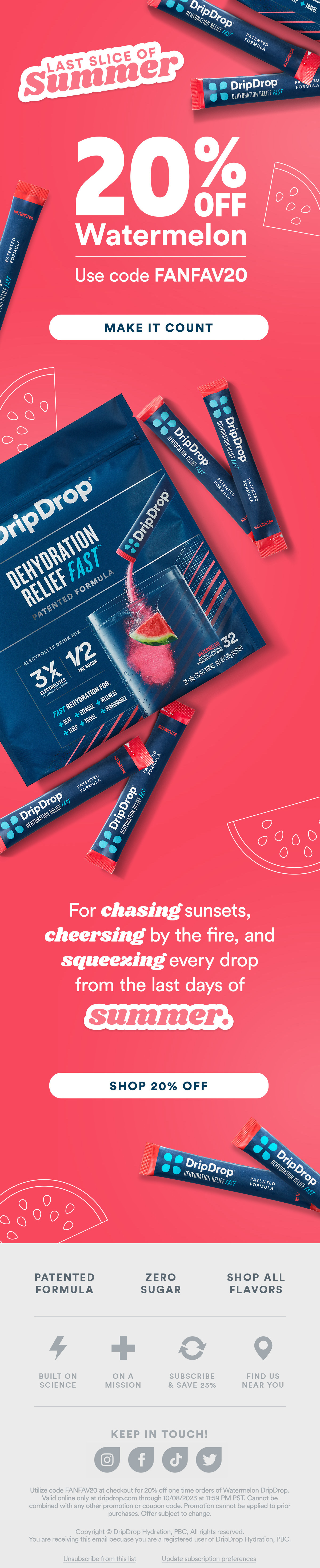
Announcement email
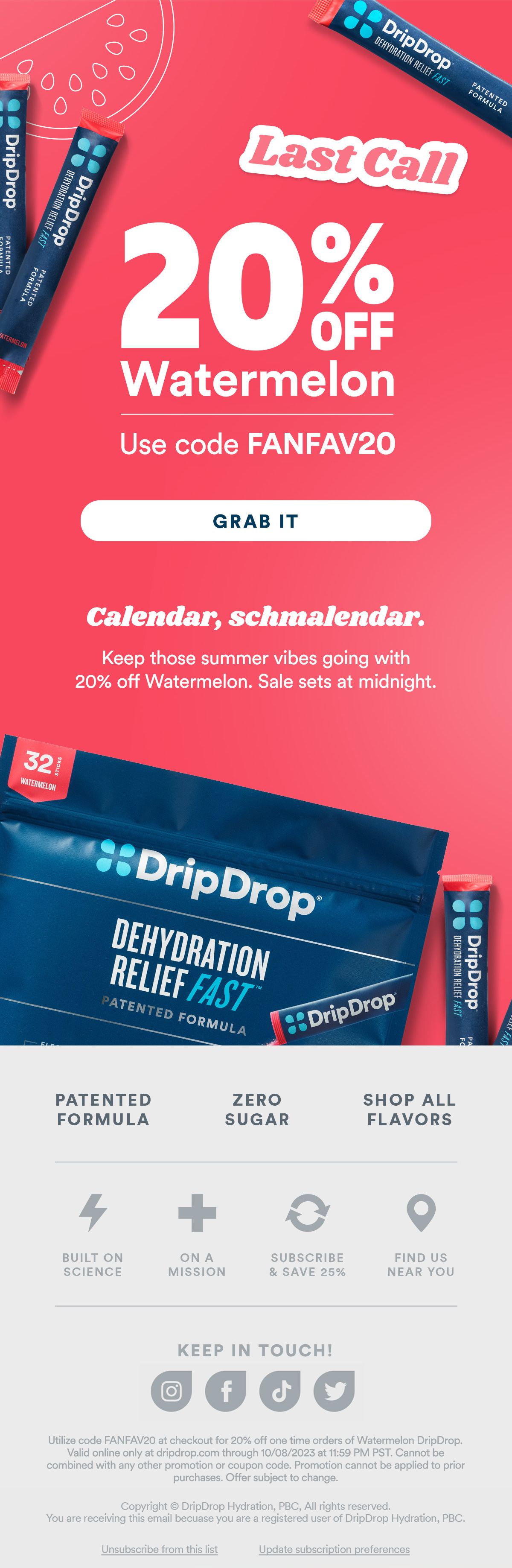
Last chance email
Google ad
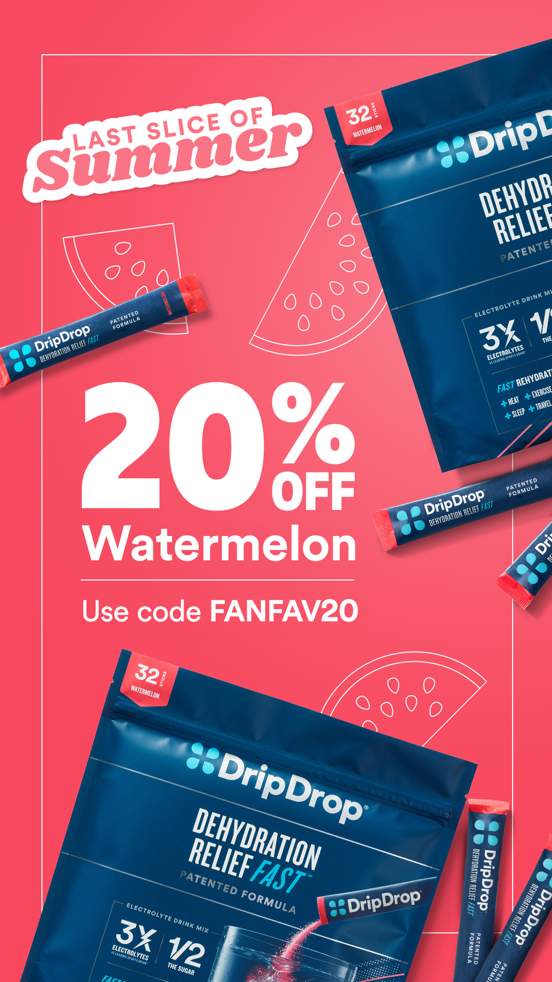
Instagram story
SMS